Information Architecture Analysis & Redesign
UX Challenge
My goal for this effort was to redesign and improve upon the information architecture (IA) and content structure for EatingWell.com, a health and cooking website. The website it its existing state had a complex hierarchy of content that was difficult to navigate and that failed to support key uses cases. Through my analysis, I aimed to determine more logical groupings of information, thereby making important workflows more intuitive.
Design Process & Solution
The main challenge was to make better sense of how the many recipes, articles, and content pages were grouped and labeled, so as to improve overall discoverability of content. In order to tackle this project, I started with an informal Expert Review to determine trouble spots both with the IA and presentation of content. This led to an inventory of existing pages in the site and ultimately a restructured sitemap. Finally, I created wireframes in Axure illustrating recommendations as to how content within pages could be more clearly presented. The wireframes contain moderate levels of interactivity. Following is a breakdown of the process I took while creating these artifacts.
Expert Review
I started this effort by doing a full inventory of the content on EatingWell.com. As part of this, I answered a series of questions that helped me to analyze existing usability issues and to begin ideating on proposed solutions. Click the preview to see the full expert review I conducted, which allowed me to to focus on the key issues that needed to be addressed through my IA redesign.
Redesigned Sitemap
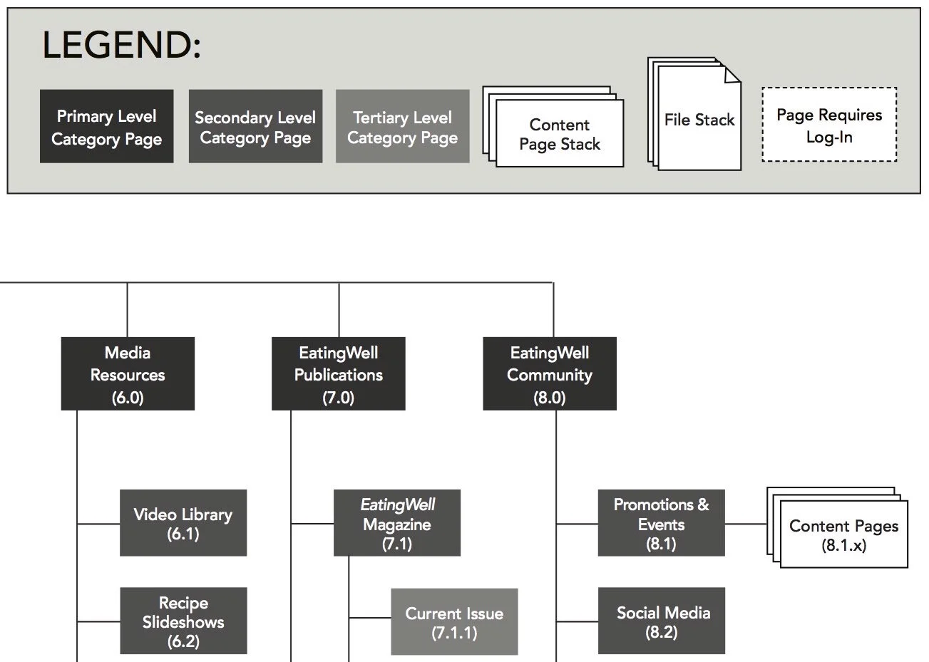
After conducting a content inventory of the existing EatingWell.com website and identifying key usability issues, I conducted some iterative design activities to rebuild the IA. My goal was to address the identified navigation issues by making the content organization more transparent. The first image below captures a visual representation of my new proposed sitemap, while the second images shows a tabular view of the content before and after the redesign.
Interactive Prototype: To illustrate my new sitemap, I built a series of wireframes in Axure showing both the redesigned navigation and recommendations for how to better present content. The goal was to show that despite the vast array of content, it is possible to structure the site in a more intuitive way, thereby improving the likelihood that users can find what they are looking for. The following images show samples of my wireframes, while the button links to an interactive prototype.
Prototype Landing Page
Sample Drop-Down with New Navigation
Sample Recipe in Sub-Navigation
My Saved Recipe Sample
